Netherlands Temperature Controversy: Or, Yet Again, How Not To Do Time Series | William M. Briggs
Today, a lovely illustration of all the errors in handling time series we have been discussing for years. I’m sure that after today nobody will make these mistakes ever again. (Actually, I predict it will be a miracle if even 10% read as far as the end. Who wants to work that hard?)
Thanks to our friend Marcel Crok, author and boss of the blog The State of the Climate, who brings us the story of Frans Dijkstra, a gentleman who managed to slip one by the goalie in the Dutch paper de Volkskrant, which Crok told me is one of their “left wing quality newspapers”.
Dijkstra rightly pointed out the obvious: not much interesting was happening to the temperature these last 17, 18 years. To illustrate his point and as a for instance, Dijkstra showed temperature anomalies for De Bilt. About this Crok said, “all hell broke loose.”
That the world is not to be doomed by heat is not the sort of news the bien pensant wish to hear, including one Stephan Okhuijsen (we do not comment on his haircut), who ran to his blog and accused Dijkstra of lying (Liegen met grafieken“). A statistician called Jan van Rongen joined in and said Dijkstra couldn’t be right because an R2 van Rongen calculated was too small.
Let’s don’t take anybody’s word for this and look at the matter ourselves. The record of De Bilt is on line, which is to say the “homogenized” data is on line. What we’re going to see is not the actual temperatures, but the output from a sort of model. Thus comes our first lesson.
Lesson 1 Never homogenize.
In the notes to the data it said in 1950 there was “relocation combined with a transition of the hut”. Know what that means? It means that the data before 1950 is not to be married to the data after that date. Every time you move a thermometer, or make adjustments to its workings, you start a new series. The old one dies, a new one begins.
If you say the mixed marriage of splicing the disjoint series does not matter, you are making a judgment. Is it true? How can you prove it? It doesn’t seem true on its face. Significance tests are circular arguments here. After the marriage, you are left with unquantifiable uncertainty.
This data had three other changes, all in the operation of the instrument, the last in 1993. This creates, so far, four time series now spliced together.
Then something really odd happened: “warming trend of 0.11oC per century caused by urban warming” was removed. This leads to our second lesson.
Lesson 2 Carry all uncertainty forward.
Why weren’t 0.08oC or 0.16oC per century used? Is it certainly true there was a perfectly linear trend of 0.11oC per century was caused by urban warming? No, it is not certainly true. There is some doubt. That doubt should, but doesn’t, accompany the data. The data we’re looking at is not the data, but only a guess of it. And why remove what people felt? Nobody experienced the trend-removed temperatures, they experienced the temperature.
If you make any kind of statistical judgment, which include instrument changes and relocations, you must always state the uncertainty of the resulting data. If you don’t, any analysis you conduct “downstream” will be too certain. Confidence intervals and posteriors will be too narrow, p-values too small, and so on.
That means everything I’m about to show you is too certain. By how much? I have no idea.
Lesson 3 Look at the data.
Here it is (click on all figures for larger images, or right click and open them in new windows). Monthly “temperatures” (the scare quotes are to remind you of the first two lessons, but since they are cumbrous, I drop them hereon in).
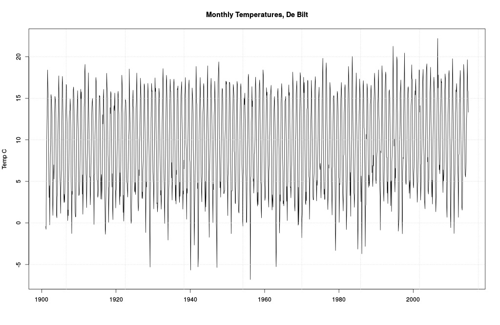
Monthly data from De Bilt.
Bounces around a bit, no? Some especially cold temps in the 40s and 50s, and some mildly warmer ones in the 90s and 00s. Mostly a lot of dull to-ing and fro-ing. Meh. Since Dijkstra looked from 1997 on, we will too.
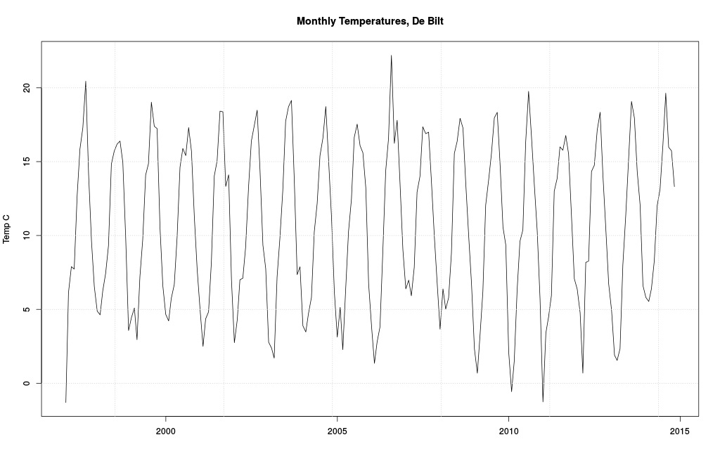
Same as before, but only from 1997.
And there it is. Not much more we can do until we learn our next lesson.
Lesson 4 Define your question.
Everybody is intensely interested in “trends”. What is a “trend”? That is the question, the answer of which is: many different things. It could mean (A) the temperature has gone up more often than it has gone down, (B) that it is higher at the end than at the beginning, (C) that the arithmetic mean of the latter half is higher than the mean of the first half, (D) that the series increased on average at more or less the same rate, or (E) many other things. Most statisticians, perhaps anxious to show off their skills, say (F) whether a trend parameter in a probability model exhibits “significance.”
All definitions except (F) make sense. With (A)-(E) all we have to do is look: if the data meets the definition, the trend is there; if not, not. End of story. Probability models are not needed to tell us what happened: the data alone is enough to tell us what happened.
Since 55% of the values went up, there is certainly an upward trend if trend means more data going up than down. October 1997 was 9.6C, October 2014 13.3C, so if trend meant (B) then there was certainly an upward trend. If upward trend meant a higher average in the second half, there was certainly a downward trend (10.51C versus 10.49C). Did the series increase at a more of less constant rate? Maybe. What’s “more or less constant” mean? Month by month? Januaries had an upward (A) trend and a downward (B) and (C). Junes had downward (A), (B), and (C) trends. I leave it as a reader exercise to devise new (and justifiable) definitions.
“But wait, Briggs. Look at all those ups and downs! They’re annoying! They confuse me. Can’t we get rid of them?
Why? That’s what the data is. Why should we remove the data? What would we replace it with, something that is not the data? Years of experience have taught me people really hate time series data and are as anxious to replace their data as a Texan is to get into Luby’s on a Sunday morning after church. This brings us to our next lesson.
Lesson 5 Only the data is the data.
Now I can’t blame Dijkstra for doing what he did next, because it’s habitual. He created “anomalies”, which is to say, he replaced the data with something that isn’t the data. Everybody does this. His anomalies take the average of each month’s temperature from 1961-1900 and subtract them from all the other months. This is what you get.

Same, but now for anomalies.
What makes the interval 1961-1990 so special? Nothing at all. It’s ad hoc, as it always must be. What happens if we changed this 30-year-block to another 30-year-block? Good question, that: this:
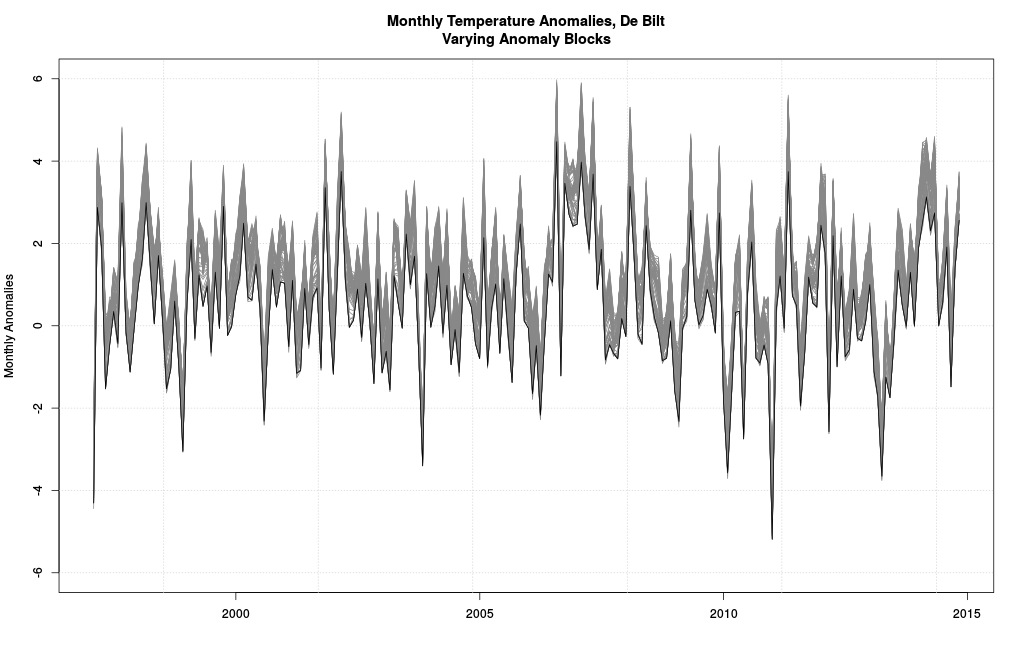
All possible 30-year-block anomalies.
These are all the possible anomalies you get when using every possible 30-year-block in the dataset at hand. The black line is the one from 1961-1990 (it’s lower than most but not all others because the period 1997-2014 has monthly values higher than most other periods). Quite a window of possible pictures, no?
Yes. Which is the correct one? None and all. And that’s just the 30-year-blocks. Why not try 20 years? Or 10? Or 40? You get the idea. We are uncertain of which picture is best, so recalling Lesson 2, we should carry all uncertainty forward.
How? That depends. What we should do is to use whatever definition of a trend we agreed upon and ask it of every set of anomalies. Each will give an unambiguous answer “yes” or “no”. That’ll give us some idea of the effect of moving the block. But then we have to remember we can try other widths. And lastly we must remember that we’re looking at anomalies and not data. Why didn’t we just ask our trend question of the real data and skip all this screwy playing around? Clearly, you have never tried to publish a peer-reviewed paper.
Lesson 6 The model is not the data.
The model most often used is a linear regression line plotted over the anomalies. Many, many other models are possible, the choice subject to the whim of the researcher (as we’ll see). But since we don’t like to go against convention, we’ll use a straight line too. That gives us this:
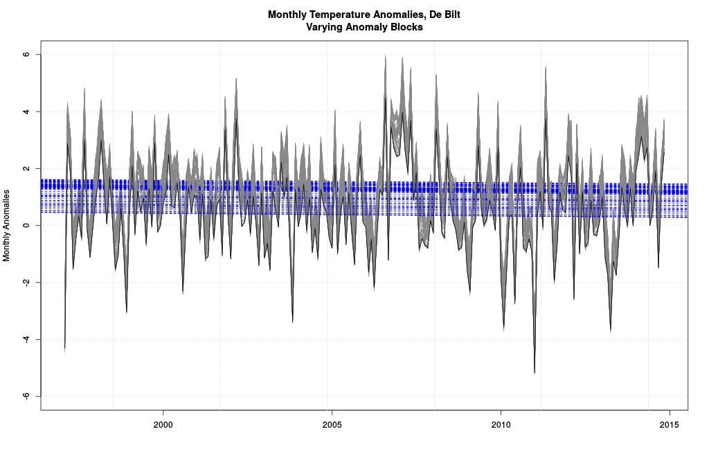
Same as before, but with all possible regression lines.
Each blue line indicates a negative coefficient in a model (red would have showed if any positive; if we start from 1996 red shows). One model for every possible anomaly block. None were “statistically significant” (an awful term). The modeled decrease per decade was anywhere from 0.11 to 0.08 C. So which block is used makes a difference in how much modeled trend there is.
Notice carefully how none of the blue lines are the data. Neither, for that matter, are the grey lines. The data we left behind long ago. What have these blue lines to do with the price of scones in Amsterdam? Another good question. Have we already forgotten that all we had to do was (1) agree on a definition of trend and (2) look at the actual data to see if it were there? I bet we have.
And say, wasn’t it kind of arbitrary to draw regression line starting in 1997? Why not start in 1998? or 1996? Or whatever? Let’s try:
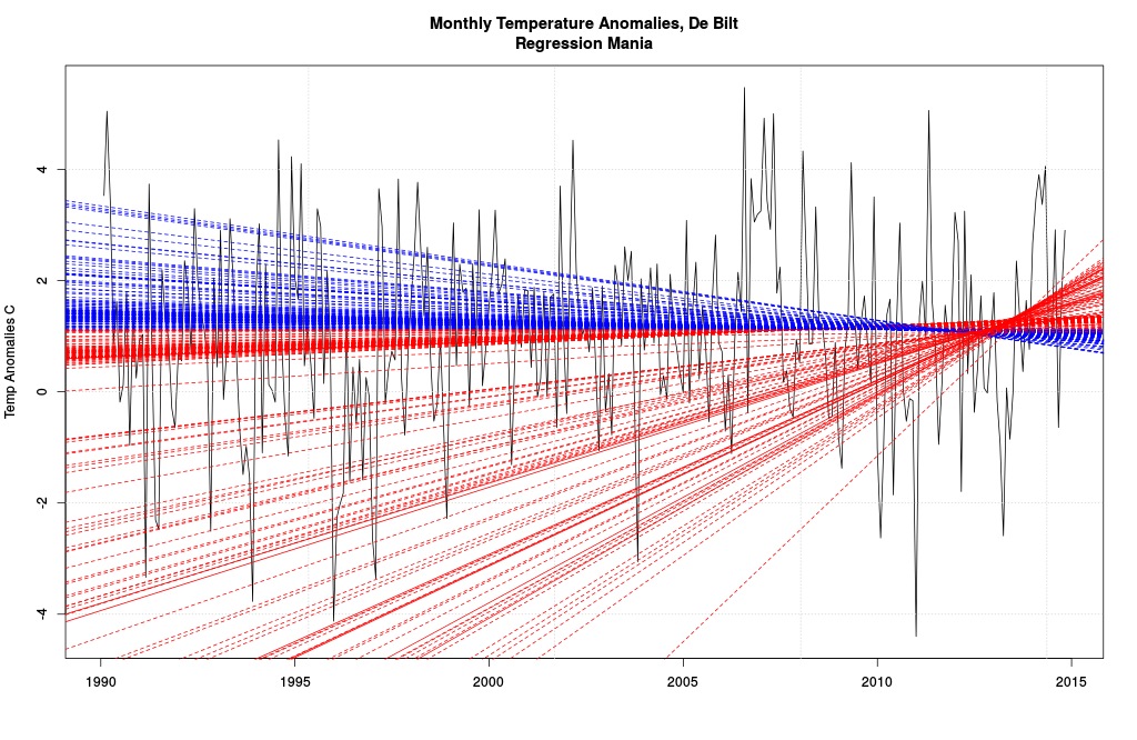
These models are awful.
This is the series of regression lines one gets starting separately from January 1990 and ending at December 2012 (so there’d be about two years of data to go into the model) through October 2014. Solid lines are “statistically significant”: red means increase, blue decrease.
This picture is brilliant for two reasons, one simple, one shocking. The simple is that we can get positive or negative trends by picking various start dates (and stop; but I didn’t do that here). That means if I’m anxious to tell a story, all I need is a little creativity. The first step in my tale will be to hasten past the real data and onto something which isn’t the data, of course (like we did).
This picture is just for the 1961-1990 block. Different ones would have resulted if I had used different blocks. I didn’t do it, because by now you get the idea.
Now for the shocking conclusion. Ready?
Usually time series mavens will draw a regression line starting from some arbitrary point (like we did) and end at the last point available. This regression line is a model. It says the data should behave like the model; perhaps the model even says the data is caused by the structure of the model (somehow). If cause isn’t in it, why use the model?
But the model also logically implies that the data before the arbitrary point should have conformed to the model. Do you follow? The start point was arbitrary. The modeler thought a straight line was the thing to do, that a straight line is the best explanation of the data. That means the data that came before the start point should look like the model, too.
Does it? You bet it doesn’t. Look at all those absurd lines, particularly among the increases! Each of these models is correct if we have chosen the correct starting point. The obvious absurdity means the straight line model stinks. So who cares whether some parameter within that model exhibits a wee p-value or not? The model has nothing to do with reality (even less when we realize that the anomaly block is arbitrary and the anomalies aren’t the data and even the data is “homogenized”; we could have insisted a different regression line belonged to the period before our arbitrary start point, but that sounds like desperation). The model is not the data! That brings us to our final lesson.
Lesson 7 Don’t use statistics unless you have to.
Who who knows anything about how actual temperatures are caused would have thought a straight line a good fit? The question answers itself. There was no reason to use statistics on this data, or on most time series. If we wanted to know whether there was a “trend”, we had simply to define “trend” then look.
The only reason to use statistics is to use models to predict data never before seen. If our anomaly regression or other modeled line was any good, it will make skillful forecasts. Let’s wait and see if it does. The experience we have just had indicates we should not be very hopeful. There is no reason in the world to replace the actual data with a model and then make judgments about “what happened” based on the model. The model did not happen, the data did.
Most statistical models stink and they are never checked on new data, the only true test.
Homework Dijkstra also showed a picture of all the homogenized data (1901-2014) over which he plotted a modeled (non-straight) line. Okhuijsen and van Rongen did that and more; van Rongen additionally used a technique called loess to supply another modeled line. Criticize these moves using the lessons learned. Bonus points for using the word “reification” when criticizing van Rongen’s analysis. Extra bonus points for quoting from me about smoothing time series.